The odds are high that you’ve heard at least the second term: mobile-friendly. Since the sophistication of cell phones circa the early 2000’s, these ubiquitous devices have become, more and more, the path of choice to the web.
 The descriptor “mobile-friendly” is used so often, it’s simply become part of the background. There is a good reason for the overly-common status of this term. But all too often, web-designers miss the point. Sometimes by a huge margin.
The way your website looks and operates on a phone is critical
By this time, most studies report that more than 60% of all Internet access is via the phone. Our company’s analytics confirm this — and, if you’ll think about it, it’s likely that your own behavior will reflect this percentage as well.
How often have you been standing in line at the bank, waiting in your doctor’s office, out at a restaurant, or [insert your own scenario here], and used any spare moment to: check your email, look at the weather report, get sports updates, and the like.
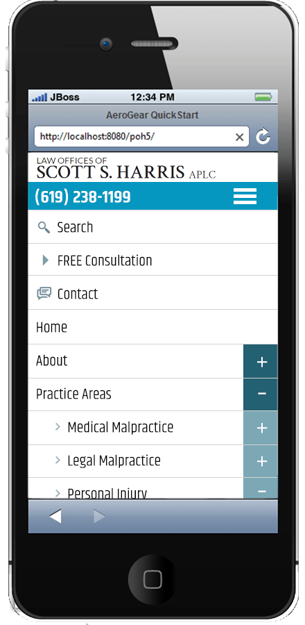
Think about the last time you ran across a website that did not behave nicely on your phone. Annoying, isn’t it? Your first instinct was probably to leave the site and find one that works more smoothly. It’s a logical reaction.
A phone is just the beginning
Okay, so we’ve established that your website must work well on the phone. And of course, we must assume that it works well on the computer in your office. But is that all you need? Not by a long-shot.
When designing a website, one of the challenges is the thousands — yes, you read that right — upon thousands of different screen size formats. Everything from a large screen monitor with a resolution of 2560 x 1640 pixels, to an Android phone, with a screen width of 3.2 inches, and a resolution of 320 x 480 pixels.

Going beyond “mobile-friendly”
Mobile-friendly means just what it sounds like: a website works on mobile devices, including phones and tablets. There are many ways to approach this challenge, and all too often, a programmer will take shortcuts that makes the job easier (for them).
There is a truism in programming: the easier the program is for a user to operate, the more difficult and complicated it is to program. Conversely, the less time a programmer takes to configure an application (which is essentially what a website is), the more difficult and complicated it is to use.
I’ll bet you can see where we’re going with this . . .
Not just responsive design: liquid design
Since it’s not possible to anticipate every device and screen format on which a website may be viewed, the optimum approach is to design a website that moves and flexes. The object is to give anyone viewing a website on any device the impression that the site was designed EXACTLY for that device. That’s liquid design.
Does your site fit these criteria? It’s easy to test:
Visit the website on a browser extended to the full width of the largest screen you can find. Using your cursor, “grab” the right-hand side of the browser window, and gradually drag it to the left — slowly “squeezing” the window until you can’t squeeze it anymore. At its narrowest width, it should roughly mimic the horizontal format of a cell phone.
Now start from the full width and perform the exercise again. This time stop “squeezing” the browser at random points during your movement. With true liquid design, no matter what width you pause the browser at, the site should appear to fill the screen perfectly. As if it were custom-designed for just that width.
Great idea! How exactly is it done?
We’re glad you asked! After many years of designing and programming websites, we’ve developed a combination approach that delivers this effect. It starts with a designer that understands programming, and a programmer that gets design.
The designer creates a website with several different widths custom-designed; usually four. Within these designs are modules that blend together seamlessly but can also move and flex as the width of the browser changes.
The programmer understands how and when to perform these flexes, so that the integrity of the design is preserved.
The end results? A website that moves and flows — like water sealed into a plastic bag as you squeeze it — maintaining its cohesive look and feel, while adapting to various conditions.
Final notes
While we are not the only website design firm doing these kinds of liquid sites, from what we can tell, we are part of a small percentage in the industry. Interested in knowing more? Just ask!
